
 Français
 Deutsch
 Italiano
 Español
Our mobile development team has been using SwiftUI since 2022 to develop the Infomaniak Mail app on iOS. It is currently one of the largest open source projects written 100% in SwiftUI. The attractiveness of the new Apple framework is undisputed, but it remains a challenge for developers. Very few companies feel confident enough to use it 100%. On the one hand, the framework is relatively new, with unclear or incomplete documentation. On the other hand, we need to fundamentally change the logic we have learned. In this article, the Infomaniak developers share their feedback on the adoption of SwiftUI for Infomaniak Mail.
Why choose SwiftUI to launch our dedicated Mail app?
We wanted to foster the rapid evolution of the app and to be able to access the latest innovations. SwiftUI is the foundation of future innovations on all Apple platforms: not only on iOS, but also on macOS and VisionOS.
This new framework brings several benefits for developers:
- Its declarative syntax allows the user interfaces to be described in a more concise and readable way.
- Its preview system allows immediate visualisation of changes without the need for compilation.
- Splitting views into reusable components optimises the maintainability of the application.
- Swift integration allows the latest language additions, such as the FormatStyle API, to be used directly in text boxes.
- Supporting internationalisation and accessibility makes it easier for everyone to use the app without having to write explicit code, unlike UIKit.
If we take stock, the historical way of doing things with UIKit still coexists very well with SwiftUI, but for how long? As we can see from many examples, Apple is promoting its new framework in a determined way. The new features of the OS require SwiftUI to be implemented, as is the case for widgets or Live Activities. The new framework thus becomes essential to support the latest features. We also wanted to prevent the application from relying on technology that is too quickly outdated.
Challenges of SwiftUI compared to UIKit
If today our team is trained in SwiftUI, it has gone through mistakes, trial and error, and delays, mainly for these reasons:
1. Continue to support legacy devices
In order to limit planned obsolescence and over-frequent replacement of appliances, they must be able to be retained for as long as possible. We voluntarily remain with SwiftUI 3 released with iOS 15 instead of SwiftUI 5 released with iOS 17 in order to support the devices of all our customers running iOS 15 (about 5% of our users).
However, this decision poses a challenge for Infomaniak’s mobile team: the framework, released in 2019 with iOS 13, is still young and is evolving very quickly. While Apple quickly fills the gaps in SwiftUI as the years go by, supporting iOS 15 limits the use of new APIs.
2. Change management
The shift to SwiftUI was initiated in 2022, while the development of a POC had already begun with UIKit. At that time, we had no experience of this new framework with our existing applications. Some of our developers, who were already experimenting with an active technology watch, took the initiative on best practices by training others with them.
Even though the environment was familiar, we had to overcome a certain resistance to change and learn a new way of doing things.
We made the decision to develop everything using SwiftUI. Each new view or component used SwiftUI and views previously developed with UIKit were progressively replaced as the mock-ups changed and needed further development.
Philippe Weidmann, iOS Tech Lead – Infomaniak
Change management was the first big challenge for a team trained and accustomed to UIKit, as the development logic is fundamentally different with SwiftUI:
With the historical UIKit method (the imperative method), we manually manage the layout and behaviour of each element of the interface by means of very detailed constraints. It is necessary to define how views and controls should be positioned and sized relative to each other and in relation to their containers. It is also necessary to establish the logic making it possible to react to different events, such as entering a field and updating the items accordingly.
With the new SwiftUI approach, it is enough to describe the view you want to obtain with the states and the relationships between the elements (the declarative method). The framework automatically manages the layout and interactions according to the application data changes (reactive programming).
In the end, SwiftUI is more efficient and intuitive once you have managed to appropriate the logic.
Learning goes through several phases, with a tendency to retain our reflexes such as:
- Writing SwiftUI in the UIKit way (we thought we were doing the right thing).
- Prioritising writing in UIKit to quickly solve a problem instead of tackling it with SwiftUI, often requiring learning through tutorials.
Then the learning curve straightens. With UIKit, we have control over every detail. It gives a full understanding of what is happening. In contrast, the ease provided by SwiftUI hides internal mechanisms. This can make some visual bugs or performance issues elusive without a deep understanding of the inside of the framework.
To overcome this, our team relied on the community, on research and a lot of testing. Empiricism has allowed us to assess the directions to be taken and to overcome the blockages.
3. Fluidity and performance
SwiftUI is a framework that is quick and easy to incorporate but more complicated when creating efficient and optimised interfaces. Optimisations are not necessarily well documented by Apple.
In our case, the Infomaniak Mail app must behave in the same way for users who have 12 emails in their in-box as for users who have 50,000 emails. The same applies to contact avatars, which must appear smoothly in all discussions, regardless of the number of participants. This was not the case.
As we explain below, we realised that there are things you shouldn’t do with this framework. But that information has to be available.
4. Application customisation: UI/UX constraints
Infomaniak relies on its own consistent visual identity across all platforms, Android and iOS, even if it is moving away from Apple conventions.
SwiftUI is sometimes resistant to customisation of components and offers few options. In a way, Apple encourages developers to use Apple’s design system, or in other words the look and feel found in native apps like Mail or Reminders.
On several occasions we had to create our own components instead of using those made available, and sometimes even fight against the framework to achieve our goals. For example, using native mechanisms, applications display the title of the views (here the name of the In-box folder for the Mail app) in a centred manner. The Infomaniak Mail app must use its own mechanism to display the title in its own way:


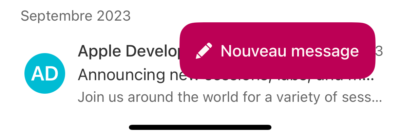
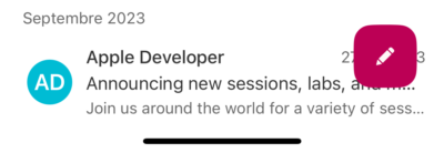
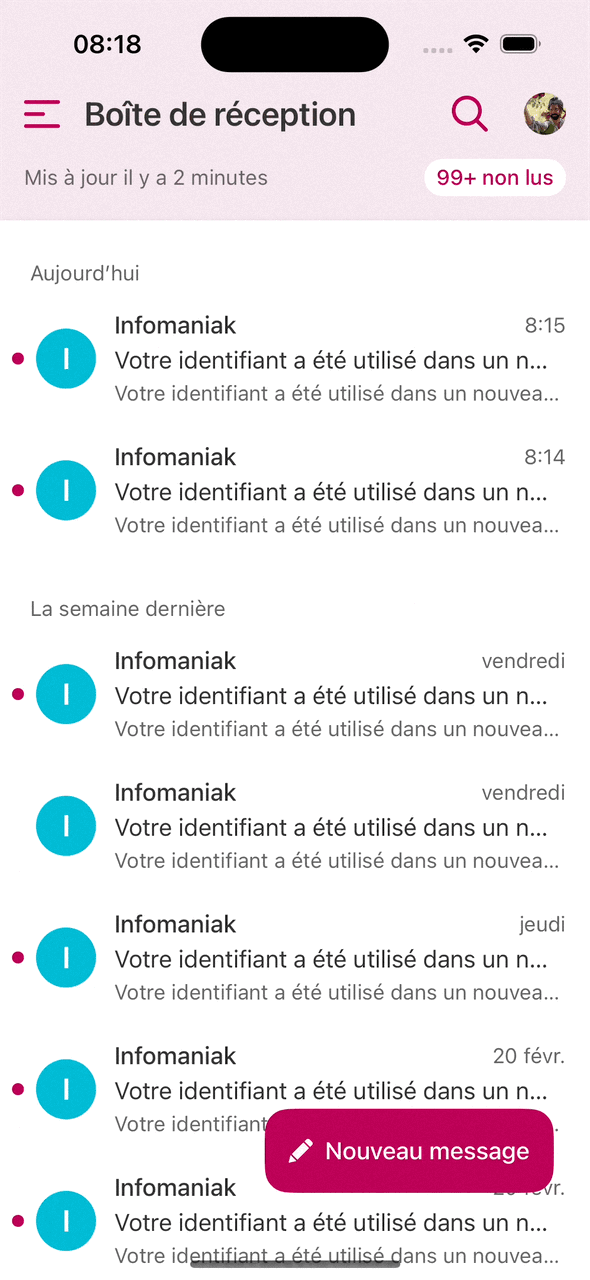
To make it easier to compose emails, our app has a “New message” button called the floating button. It does not exist in the iOS design system, but rather in Android apps. We had to develop it from scratch.
This button should also retract automatically to give the user space to view their email list when scrolling through it. This is a technical challenge, as you need to know when the user is scrolling through the list and SwiftUI does not offer a simple mechanism to do so.
The Infomaniak Mail app also allows the user to select emails by pressing and holding down to act on several messages. This mechanism is not offered natively by SwiftUI, as it deviates from Apple standards. So we created everything by ourselves.
Customisation meant we had to learn in order to go beyond the Apple scenarios.
SwiftUI simplifies component creation and design iteration, but customisation remains challenging. When it comes to components, UIKit is more time-consuming and verbose, but it’s much easier to do what you want in terms of customisation.
Philippe Weidmann, iOS Tech Lead – Infomaniak
Implementation of the main components of the Infomaniak Mail app with SwiftUI
Three major components of the Mail app posed specific challenges linked to SwiftUI:
1. The email list: the part that requires the most performance
The email list is a focal point of the user experience. It can contain a large number of elements, in several display modes (compact, standard, large). In practice, some users keep all their emails in a single folder. We therefore need to make sure that navigation is always smooth and efficient, regardless of the number of emails in the user’s list.
In its documentation, Apple suggests that using the “List” component of SwiftUI should be simple: we take each item from our list and then display it. Theoretically, the developer should not need to look any further.
But in reality, it’s not so simple. When there are many elements, the constraints of a smartphone can impact performance. There have always been mechanisms built into iOS to display long lists without affecting fluidity. Reuse of cells in a list occurs when the system displays only the items that are visible on the screen and will reuse the items as they appear on and disappear from the screen. SwiftUI hides these mechanisms from developers and the framework itself ensures the reuse of cells for reasons of simplicity.
The way we initially implemented our list did not allow SwiftUI to properly ensure the reuse of items or to calculate differences following a change in it. In tangible terms, a list of 50,000 emails could take more than a second to display on older devices while slowing down the rest of the interface considerably. The List component documentation did not provide any explanation for this problem.
Performance issues are a recurring issue with SwiftUI. The developer documentation did not explicitly mention the performance impact of using a flow controller directly within a list. It was only with the guidance of a short passage of a video (Demystify SwiftUI Performance) for WWDC 2023 that we were able to solve our problems and significantly improve our performance.
Apple’s documentation is generally good, but we strongly recommend that developers follow the WWDC video sessions, which are full of interesting information and are very well produced. All available free of charge.
2. Writing a message
The message writing part consists of the following two main elements:
- The header section (which includes the recipients and the subject of the email)
- The body of the message (which is a webview)
In the header, the Mail app suggests contacts with the name and avatar that are displayed. When the contact is selected and validated, its name becomes a component called a “chip” (small button) and is added to the recipient list. If activated by the user, this chip displays a dialogue window making it possible to delete the recipient. These elements are typically not provided for by SwiftUI and have required tailor-made development.
In the body of the message, the user writes the text in a WebView. In other words, they write an HTML page without realising it. On the developer side, we need to establish the link between the content of the message as it is displayed in the Webview and what will finally be sent to the recipient (the native code) by the server.
Writing a new message is one of the main entry points for an email application. So a friction point may be important in the user experience. As webview on mobile is quite a heavy component, our team will develop a new container from scratch this year to obtain a better performance.
Philippe Weidmann, iOS Tech Lead – Infomaniak
3. The personalised side menu
Just like the “New Message” floating button, the sliding side menu that can be deployed by pressing the “Hamburger” button at the top left is not a standard component on Apple platforms. It’s more part of Google’s Material Design (Android). It is based on a library that makes it possible to optimise and standardise the behaviour of the elements on all devices. But depending on how you design this sliding menu with SwiftUI, it can be very inefficient. We had to develop it from scratch to get the same look and feel.
These customisations require specific development in themselves, but also generate more work over time.
As we have made a lot of components not provided for by SwiftUI, we must systematically postpone these additions for other platforms such as iPadOS and possibly for macOS. Adaptations that we would not have had to implement if we had followed the Apple framework to the letter without integrating our own design system. The arrival of new platforms such as VisionOS, for example, gives food for thought, as they makes it more difficult to adapt our customisations.
The natural behaviour of a side menu is to open or hide from the left side of the screen by following the user’s thumb. Since there is no native component in SwiftUI for this behaviour, this view had to be implemented from scratch. In tangible terms, this means superimposing the menu view on the main view and shifting it to the left until it becomes invisible in order to hide it and vice versa to display it.
Initially, the menu content was not separated from the menu container itself, which posed major performance problems. Indeed, for each change in the shift of the menu (i.e. each animation pixel to the left or right), the whole view was redrawn. On a recent phone, the slowdown was not visible, but still consumed too much CPU by our criteria. On an older phone, the user could perceive a slowdown.
So the first step was to identify and measure the problem using instruments to make sure that the changes made were making a real difference.
We then separated the view that contains the menu (the container) from the content itself. This allows the SwiftUI framework to redesign only the container without touching the content, thus gaining significantly in terms of performance.
Review of the switch from UIKit to SwiftUI
What if we had to do it again? We would still choose SwiftUI, but we would move forward more gradually.
In hindsight, it was quite bold and even painful to move 100% to SwiftUI in one go.
Initially, I was rather against developing the Infomaniak Mail app entirely in SwiftUI. It was a tough decision to make, but today, if it had to be done again, that’s what we would do. It gives us a big advantage with regard to the maintenance and evolution of the application in the future.
Joris Bodin, Developer Team Leader – Mobile and Desktop
We see the advantages of SwiftUI by going back to work on our older applications written in UIKit. A UIKit ViewController that manages a list can quickly end up with several hundred lines to write and maintain, whereas a few SwiftUI lines might suffice.
When developing in SwiftUI, we mainly focus on the data to be displayed, while UIKit requires a lot of coating to achieve what we want.
SwiftUI represents the future. The framework brings life-changing advances, such as previewing the rendering of the live app in the development interface. Historically, Apple has shown that when it offers cutting-edge technology like SwiftUI, it keeps it going over time. We therefore know that our efforts will probably not be wiped out in three years, unlike Google, which offers more novelties, but puts them to one side more quickly. In this respect, the SwiftUI Android equivalent, JetPack Compose, is driven by a company other than Google, JetBrains. We think this gives JetPack Compose more hope of lasting.
Even though UIKit is far from being outdated and remains a good option in many cases, SwiftUI is gradually taking hold. Its many assets facilitate the development and ensure the future of Apple platforms. While it might be scary, you should not hesitate to take the plunge.
Valentin Perignon, Infomaniak iOS developer
One of the main challenges we faced was: “How do you have your own identity while respecting Apple’s guidelines?” We have seen that what is not provided for in the framework results in a higher volume of work.
We would advise developers who are hesitant about getting started to do it gradually. One lesson learned from this experience is that “if you find it complicated, you’re probably doing something wrong.”
The SwiftUI documentation does not cover everything and we had to investigate to find answers, especially regarding performance. We recommend watching Apple Online Conferencing (WWDC) videos that contain key information that can unlock a situation.
For our other apps, kDrive was originally developed on iOS 12 with UIKit because SwiftUI arrived only from iOS 13 with missing components. As we were not able to use SwiftUI at the time, we are not able to reuse kDrive components in the Infomaniak Mail app. We intend to migrate to SwiftUI little by little, having learned from our experience with the Mail app.
Professionally, mastering state-of-the-art technology like SwiftUI is an important value in the job market. We still advise young developers to familiarise themselves UIKit, because many companies have not yet made this change. SwiftUI is a young, “fashionable” technology that few people are currently familiar with and we are pleased that we have now gained more expertise in using it.


You must be logged in to post a comment.